
User Experience Basics: What Actually Makes a Product Easy to Use
Open any app right now and try to remember the last time you actually noticed its design. You probably can’t — and that’s the point. Good UX is invisible. You only notice it when it breaks: the form that wipes your data when you hit back, the checkout button that’s two pixels too small on mobile, the settings menu buried four taps deep.
I’ve spent years auditing products where every individual screen looked fine in isolation, yet users still got stuck, confused, or gave up halfway through. That gap — between “this looks designed” and “this actually works for people” — is what user experience basics are really about. Not wireframes. Not Figma files. Whether a real person can get from “I want this” to “I got this” without friction.
This guide skips the textbook definitions you’ve already read ten times. Instead, you’ll get the actual mechanics: what UX is built from, where most teams quietly get it wrong, and how to evaluate it like someone who’s been burned by bad design decisions before.
What Is User Experience, Really
User experience is the sum of everything a person thinks and feels while trying to accomplish something with your product. Not just whether they succeeded — how much it cost them mentally to get there. Confusion, hesitation, backtracking, rereading a button twice because the label didn’t make sense — that’s all UX, even though none of it shows up in a screenshot.
The ISO standard definition calls it “a person’s perceptions and responses that result from the use or anticipated use of a product, system or service.” That’s accurate, but it misses something practical: UX isn’t a fixed quality a product has. It’s relative to the person, their context, and what they’re trying to do in that moment. A power user and a first-time visitor can have wildly different experiences with the exact same screen.
Quick answer for snippet purposes: User experience (UX) basics refer to the foundational principles of designing products around what users need, how they think, and how they behave — covering usability, accessibility, findability, and the emotional response a product creates during use.
UX vs UI — the distinction people still get backwards
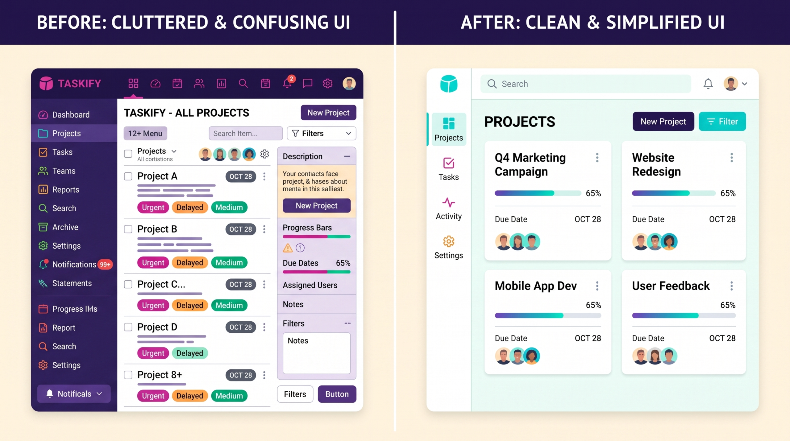
UI is what you see. UX is what you go through. A login screen with gorgeous typography and a satisfying button animation is UI. Whether that same login screen lets you in without three password resets is UX.
Here’s a comparison that actually clarifies it instead of repeating the cliché:
| Aspect | UI (User Interface) | UX (User Experience) |
| Focus | Visual layer — color, type, spacing, icons | Structural layer — flow, logic, task sequence |
| Question it answers | Does this look right? | Does this work right? |
| Deliverables | Mockups, style guides, component libraries | Flows, wireframes, research findings, journey maps |
| Can exist without the other? | A UI can look great with terrible UX underneath | A UX can be solid with plain, unstyled UI |
| Example failure | Inconsistent button styles | A checkout flow that loses cart data on back-button |
You can have stunning UI sitting on top of a broken UX — a beautifully designed app where nobody can find the one button they came for. You can also have plain, almost ugly UI that works so well people stop noticing the design entirely. Early Craigslist is the go-to example for a reason: visually it hasn’t changed in decades, but the task flow — post an ad, browse listings, contact someone — is so direct that millions of people tolerate the look because the experience underneath just works.

Why User Experience Basics Actually Matter for a Business
UX isn’t a design-team concern that lives in isolation from revenue. It shows up directly in the numbers that matter to whoever’s funding the product.
Slow load times push people toward the back button before they even see what you built — speed perception alone changes whether someone trusts a brand enough to buy from it. Confusing checkout flows are one of the most common reasons carts get abandoned, even when the product itself is exactly what the shopper wanted. Poor mobile usability matters even more now that more than half of web traffic comes from phones, where thumb reach, tap targets, and one-handed use change every design decision you’d make for desktop.
None of this is abstract. A SaaS dashboard that takes four clicks to reach the most-used feature trains users to dread opening it. An onboarding flow that asks for fifteen fields before showing any value loses people before they ever experience what the product does well. These aren’t edge cases — they’re the default outcome when UX gets treated as a polish step instead of a design constraint from day one.
The Core Building Blocks of UX
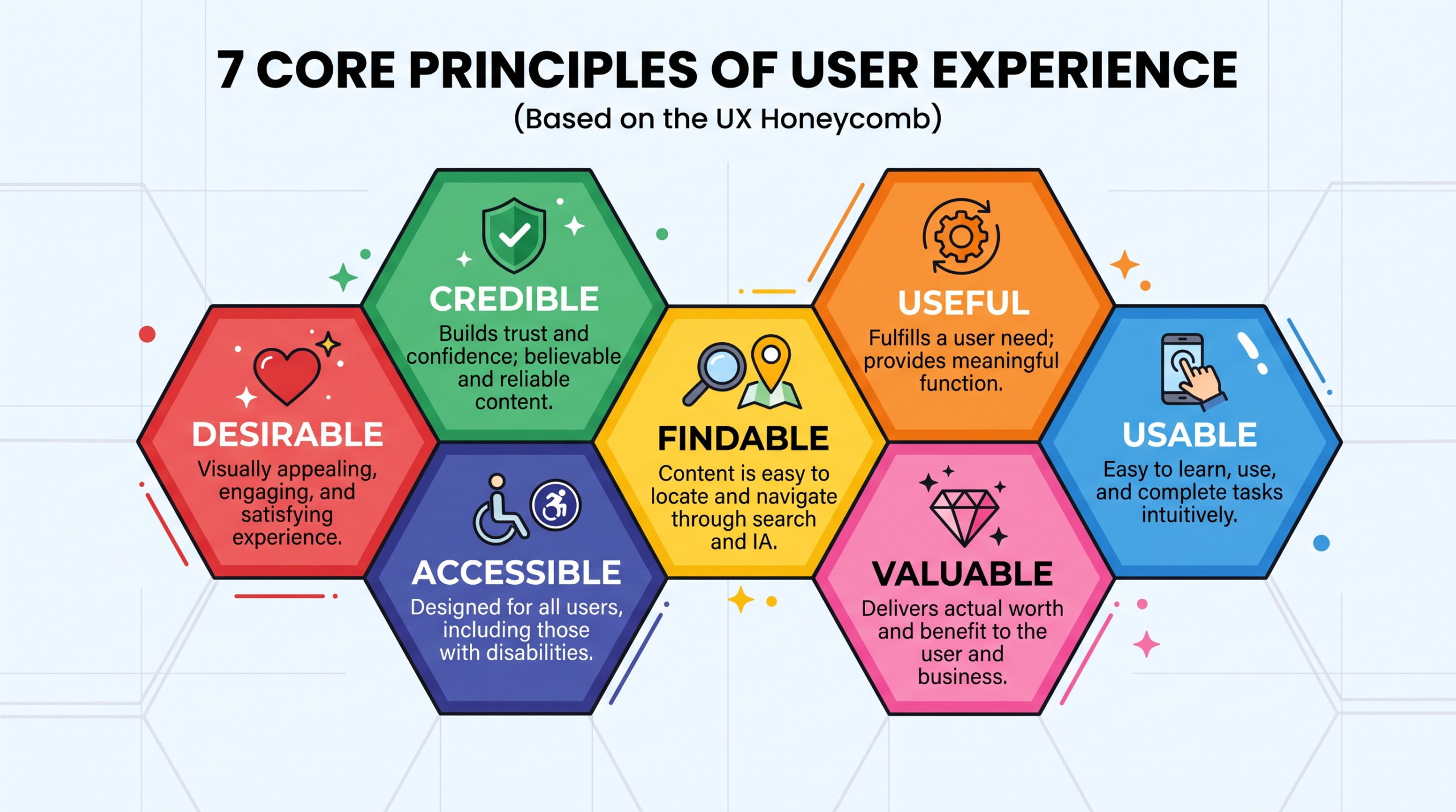
Most explanations of UX basics list Peter Morville’s “Honeycomb” model and stop there. It’s a useful map, but treating it as a checklist misses how these pieces interact — usually in tension with each other, not in harmony.
Useful
Does the product solve something real? A flawlessly designed tool for a problem nobody has is still a failure. Usefulness is the floor, not a bonus feature.
Usable
Can someone accomplish their task without unnecessary thought? Usability is about reducing the cognitive tax of using something — fewer decisions, clearer labels, predictable behavior. George Miller’s research on working memory suggested people can hold roughly seven items in mind at once. In practice, that’s part of why navigation menus with five to seven top-level items perform better than ones with fifteen — past that point, people stop scanning carefully and start guessing.
Findable
If the feature exists but nobody can locate it, it functionally doesn’t exist. This is where a lot of well-built products quietly fail — the capability is there, buried under three settings menus.
Accessible
Designing for people with visual, motor, auditory, or cognitive differences isn’t a separate checklist you bolt on at the end. Poor color contrast, missing alt text, and unlabeled form fields exclude real users — not hypothetical edge cases. WCAG guidelines exist specifically because “looks fine to me” is not a reliable accessibility test.
Credible
Would you trust this enough to put your payment info into it? Visual polish, consistent behavior, working links, and honest copy all contribute to whether someone believes what the product tells them.
Desirable
The emotional layer — does using this feel good, or merely tolerable? Duolingo’s gamified streaks and mascot guilt-tripping are a desirability play layered on top of a genuinely tedious task: daily language drills.
Valuable
Does the experience deliver value to both the user and the business? A product that delights users but never converts isn’t sustainable. A product that converts ruthlessly but frustrates users won’t keep them.
These seven factors pull against each other constantly. Making something more accessible sometimes means simplifying visuals that designers find “less desirable.” Making something more findable can mean adding navigation that makes the interface feel busier. Good UX work is mostly about managing these trade-offs deliberately, not maximizing every factor at once.
User-Centered Design: The Process Behind the Principles
User-centered design (UCD) is how teams actually arrive at good UX instead of guessing. It’s research-driven, iterative, and — this is the part people skip — frequently uncomfortable, because it means building based on what users actually do instead of what the team assumed they’d do.
Step 1: Understand the problem before touching any screen
Talk to actual users. Not five people in a Slack channel who already love your product — people who represent your real audience, including the skeptical and the confused. Surveys, interviews, and support ticket analysis all surface patterns that internal assumptions miss completely.
Step 2: Map the user flow
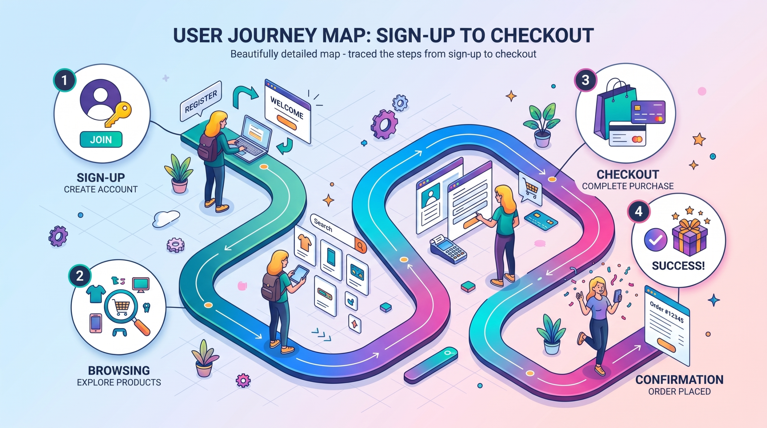
A user flow is the path someone takes to complete one specific task — signing up, checking out, finding a setting. Map it before designing any screen. This is where you catch the four-click problem before it ships, not after a support team starts fielding complaints about it.
Step 3: Build low-fidelity first
Wireframes, paper sketches, rough prototypes. The goal here isn’t to look finished — it’s to test the structure cheaply before investing in visual design that might get thrown out. Teams that skip this step often end up polishing a flow that was broken from the start.
Step 4: Test with real people
Sit someone down, give them a task, and watch — don’t explain, don’t help, don’t interrupt. The moments where they hesitate, misclick, or say “wait, what does this do?” are worth more than any internal review meeting. This is usability testing, and it’s uncomfortable the first few times because you’re watching your own assumptions fail in real time.
Step 5: Iterate based on what broke, not what you’d prefer to fix
It’s tempting to fix the small visual thing you personally dislike instead of the structural problem three users got stuck on. Prioritize by what actually blocked task completion.
Common Mistakes Teams Make With UX Basics
- Designing for the team’s mental model, not the user’s. Once you’ve built something, you understand it intuitively. New users don’t have that context, and “it makes sense once you know it” is not a defense — it’s the problem.
- Treating accessibility as a compliance checkbox added at the end. Retrofitting accessibility after launch is slower and more expensive than designing for it from the start, and it usually shows.
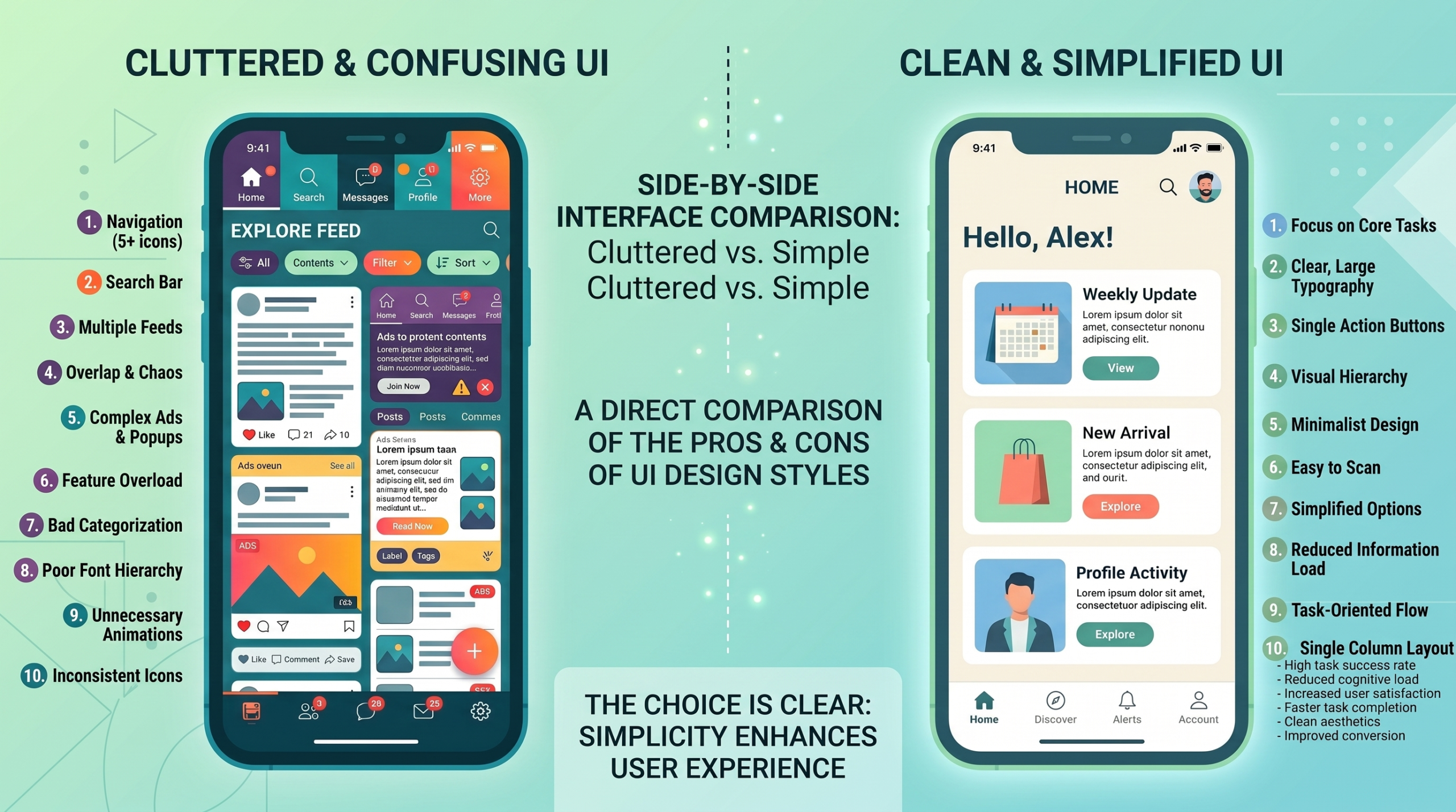
- Confusing more features with better UX. Every added option increases the cognitive load on everyone who didn’t ask for it. The feature you’re proud of might be the reason someone else abandons the flow.
- Skipping research because “we already know our users.” Assumptions calcify fast, especially once a product has existed for a few years. The users you started with are rarely identical to the users you have now.
- Optimizing for the demo, not the real first-use experience. A flow that looks great when a designer walks through it with a script is a different experience than a confused first-time user encountering it cold, with no narration.
- Mistaking visual polish for usability. A beautifully animated interface that takes longer to complete a task than a plain one is a UX regression dressed up as progress.
Expert Tips for Getting UX Basics Right
- Ignore the visual layer first when auditing an existing product. Strip away color and styling mentally and ask: does the task sequence make sense on its own? If the answer’s no, no amount of visual refinement will fix it.
- Watch for the gap between “technically works” and “works well.” A feature that exists but takes ten minutes to find has effectively failed, even though it shipped.
- Keep navigation lean. Five to seven primary options beats fifteen, almost every time, because people stop reading carefully past that point and start guessing.
- Test with people outside your existing user base occasionally. Loyal users have already adapted to your quirks — they’re the worst group for catching onboarding friction.
- Treat speed as a UX feature, not an engineering afterthought. Perceived performance — loading indicators, skeleton screens, optimistic UI — often matters more to how “fast” something feels than the actual milliseconds saved.
- Don’t let one stakeholder’s personal preference override usability testing data. The loudest opinion in the room is rarely the one that matches what users actually did when nobody was watching.
Frequently Asked Questions
What is the simplest definition of user experience?
User experience is how someone thinks and feels while using a product to accomplish a goal — including how easy, confusing, fast, or frustrating that process felt, not just whether they finished the task.
Is UX the same as UI?
No. UI is the visual layer — colors, type, layout. UX is the structural layer — whether the sequence of steps makes sense and gets the user where they’re trying to go. A product can have great UI and poor UX, or the reverse.
What are the seven factors of good UX?
Peter Morville’s Honeycomb model lists useful, usable, desirable, findable, accessible, credible, and valuable as the seven elements that together describe a meaningful, well-rounded user experience.
Do I need to know how to code to learn UX basics?
No. UX is fundamentally about research, problem-solving, and structuring tasks around human behavior. Many strong UX practitioners never write code, though understanding technical constraints helps when collaborating with developers.
What’s the difference between UX and customer experience (CX)?
UX focuses on a person’s interaction within a specific product or service. CX is the broader relationship across every touchpoint a customer has with a brand — support calls, billing, marketing — of which the product’s UX is just one part.
Why does accessibility matter for UX basics?
Because excluding users with visual, motor, or cognitive differences isn’t a minor edge case — it’s a direct loss of real users who simply can’t complete the task. Accessible design also tends to improve usability for everyone, not just the people it was built for.
How do I know if a product has bad UX?
Watch for hesitation, backtracking, repeated misclicks, or someone abandoning a task halfway through during a usability test. If users can’t explain what a button does without guessing, that’s a UX signal, not a UI one.
What tools are used for UX work?
Figma and Sketch for wireframing and prototyping, Maze or User Testing for usability testing, and FigJam or Miro for journey mapping and team workshops. Tools matter less than the research and iteration process behind them.
Final Verdict
User experience basics aren’t complicated in concept — solve a real problem, make it easy to do, make sure people can find it, and don’t exclude anyone along the way. What’s hard is holding all of that together once real constraints show up: deadlines, stakeholder opinions, technical limitations, and the gap between what your team assumes and what your users actually do.
The teams that get UX right aren’t the ones with the most talented visual designers. They’re the ones willing to watch a real person struggle with their product, resist the urge to defend the design, and fix what actually broke instead of what they personally wanted to change. That discipline — more than any framework or honeycomb diagram — is what separates products people tolerate from products people come back to.